jeudi 30 mai 2013

DSDN101 Clip critique Christie Higgins:


  Christy has a very interesting and well done clip on her blog. She used text and drawing to communicate here ideas in a clear manner. I found the colors to have been well chosen as children tend to respond better to vibrant colors.
   She has a clear idea of where she is going with her clip and her final idea. The final clip will be done in a similar fashion with text and pictures appearing on screen so as to get her message across. The only point of criticism I would have for her final project is that she wants to have the whole clip be in black and white with only the logo being given any color. Even though this would put the emphasis on the logo thus helping it stick in peoples head, I think it would diminish the global interest the children would have for the project as they tend to register less with dull colors whereas if the clip were to have some vibrant colors in it, the children's attention would be drawn thus resulting in more participation.
   Over all, I think Christie is on the right track and I would be curious to see the final clip.

DSDN101 Stop motion for critic.


DSDN101 P3 story board


mercredi 29 mai 2013

DSDN171 P5 Academic writing


Objects made using an Art Nouveau style are crafted in such a way that they are as much a functional object as a piece of art. If art is a finality without an end, as it is the result of a process that has no other purpose than to exist on itself; And function is defined by a set list of criteria that define the object, it is only natural to ask our selves if this fusion of art and function is relevant.
Pugin, who was an important figure of the Gothic Revival, would have been extremely critical of this style as it displays its opposition to “the true principles of art and design” and displays “cheap and false magnificence” (A. W. N. Pugin, 1843) because of it's ostentatious nature and the fact that it displays decorations that wouldn't be, according to Pugin, appropriate decoration for the function that the object serves. A member of the Arts and Craft movement would hold a similar argumentation. Hence from their point of view, the Art Nouveau style is irrelevant as it's fusion of art and function is fundamentally contradictory in nature.
For Kant, the question of beauty in art is distinct from that of the function. Jugging if an object is functional is the same as proving a scientific theory. It is applying a set of universal criteria to a singular object. On the other hand, the “reflective judgment”, jugging of the beauty of the object, can not claim to be universal nor can it be associated with concepts of utility or pleasure. Thus art is totally distinct from the function of an object and are not mutually exclusive.
To conclude, because art and function are not mutually exclusive, one can not say that the Art nouveau style is irrelevant. On the other hand, this does not mean that one must decorate an object in such a way that it becomes a piece of artwork, it can be done or may not be done as the designer sees fit.

Bibliography:
Pugin, A.W.N. (1843). An Apology for the Revival of Christian Architecture in England. London, Great Britain: John Weale.
Kant, E. (1781). Critic of pure reason. Riga: J. F. Hartknoch

Kant, E. (1781). Critic of practical reason. Riga: J. F. Hartknoch

mardi 21 mai 2013

The two experiments donne using flash for a stop motion video:

20fps:
10fps:

dimanche 19 mai 2013

DSDN101 P3 brief


A copy of my design brief for 101:


    I intend to create a video promoting the slum challenge for the Caritas Challenge. I reflected on what this challenge is trying to show and thus looked at what people without shelter were exposed to, hence I came up with several ideas: exposition to the elements, wind, storms, rain, snow, lightning, flooding, heat, wild animals, etc. The challenge also promotes generosity and helping, thus I will also introduce such knowledge. Finally the Challenge is aimed at children thus the characters in the clip will be children.
     For this project I intend to use a mix of hand drawn animation and stop motion. Each frame will be drawn on an independent piece of paper. These will be stacked up and each one will be removed one at a time. The resulting pictures will than be used to create the stop motion clip. In a similar manner to a flip book. Once the final picture is removed, it will reveal the cardboard base on which the pictures were stacked, following which, a stop motion animation will reveal the Caritas Challenge logo logo. I have chosen a abstracted style of drawing with pastel colors similar to a child's drawing to appeal to a younger audience as well as a more mature one.

DSDN111 Project 3 the Joint sketches.


mercredi 15 mai 2013

DSDN101 Critas Chalenge logo.


Final pictures for the Caritas logo done in colaboration with: Tony Twohill, Steven Turrell and Laura Wallace.

samedi 11 mai 2013

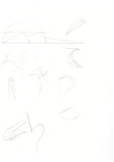
DSDN111 P2 Fluid Form

Precedent immages for project 2:


Sketches and drawings for project 2


Photos of the models done during the process:


A couple images of the presentation drawing (sorry about the two parts I didn't manage to get an A3 scan of it):


Finaly a few photos of the final form:


The idea for this project took its inspiration from sea creatures. The tread is used as an element of tension that holds the whole piece together. The outer "shell" goes around the wire "skeleton" and suggest the curve it forms continues around the wire. Finlay there is a play on transparency between the different parts of the shell that reveal smaller triangular shapes.
A note on the presentation drawing, it is deliberately made of two A4 pieces taped together and folded so that the shell parts drawn in the middle will also fold in the same way as they do on the model.

vendredi 10 mai 2013

DSDN171 Project 4 Trade Me Hunting

 
    A silver and crystal table snuff box found on trade me ( http://www.trademe.co.nz/antiques-collectables/silver-metalware-tins/silver/sterling/auction-587007867.htm ), auctioned by the user mopar110 and described as follows:

“A really nice sterling and crystal antique art nouveau table snuff box in excellent condition. Hallmarked for 1904 in the town of Birmingham by silversmith Deakin & Francis this snuff box stands 2.5cm high,7cm wide & 3.5 cm deep. There are no rub holes or tears the sterling lid is golded (sic) on the inside the crystal has a couple of small flea bites.”


    This silver and crystal table snuff box was put on auction by a user with the alias of mopar110. He claims it is a art nouveau design and I am inclined to concur. Looking at the box we can observe complex carving representing flowers and what seems to be an aubergine. These motifs are in accord with the traditional curvilinear organic and botanical aspects of Art Nouveau design that is derived from a historical influence from Rococo that also originated in France. They are very reminiscent of the drawings of Hernst Heackle in “Art Forms in Nature” (Germany 1862). The box is further decorated with elements related to the exotic nature of art nouveau. Along the side of the lid we can observe a frieze made up of crescent shapes, very reminiscent of Islamic and, in general, Middle-Eastern art and architecture as the crescent is a recurring symbol in the Middle-East. Moreover, the sides of the box are decorated with geometric patterns, yet again, reminiscent of Middle-Eastern art and architecture, more specifically tiles and mosaics that can be found in Middle-Eastern architecture. Finally, the bottom of the box is decorated with a compass rose, this element also implies the theme of travel that goes with the exotic influence of Art Nouveau. The materials out of which the box is made also account for the Art Nouveau style of the box; having been made of crystal, sterling silver and gilded on the inside, these are pretty expensive if not exotic materials. Finally, the last element that supports this box being an Art Nouveau piece is the date at which it was created, 1904 is towards the end of the Art Nouveau period.
     Someone like A. W. N. Pugin, who was an important figure of the Gothic Revival, would have been extremely critical about this box as it displays its opposition to “the true principles of art and design” and displays “cheap and false magnificence” (A. W. N. Pugin, 1843) because of it's ostentatious nature and the way the silver is shaped to resemble flowers which wouldn't be, according to Pugin, appropriate decoration for the function that the object serves. A defender of the Arts and Craft movement would also say something similar, considering this box to be amoral.
     Though I respect both these points of view, I find this box to be fairly subtle as the choice of materials makes for a relatively “white” and discreet piece that while not being suitable for all interiors could fit harmoniously into even certain modern interiors. It is a nice and well crafted box.


Bibliography:
Pugin, A.W.N. (1843). An Apology for the Revival of Christian Architecture in England. London, Great Britain: John Weale


jeudi 9 mai 2013

DSDN101 P2 Part 6


DSDN101 P2 Part 5


DSDN101 P2 Part 4


DSDN101 P2 Part 3


DSDN101 P2 Part 2


 Initial design.

DSDN101 P2: Part 1


DSDN101: design brief:

I have no cultural background whatsoever. Having traveled around the world for the entirety of my life and never stayed in a country long enough to feel part of it's culture it is hard for me, if not impossible, to pinpoint exact cultural references to create a pattern that draws exclusively from a single culture though I can take elements from different cultures. Thus I have decided to go for a “personal” pattern that has nothing to do with where I come from, as I don't come from anywhere, but a pattern that represents who I am now.
To achieve this I will be looking at my personal traits and personality as well as the trinkets, the colors that represent me. So far as personality goes, I seem to pass as an unexpressive and cold person, a brooding individual, That directed me towards my colors, choosing cold tones of black and pale blue. I integrated four wings to the design, they have several meanings, their number represents the month of April in which I was born. Finally the bottom pair of wings is placed so as to remind a long coat like the one I wear. I deliberately decided not to add sound to the animation to keep with my quiet nature.

mercredi 1 mai 2013

DSDN171 Poster final

Final for my poster for project 3 of DSDN171.
I was inspired by the Glasgow school of design and it's Japanese influences to create a vertical block of text, an other source of inspiration were posters for marine life expositions and aquariums.