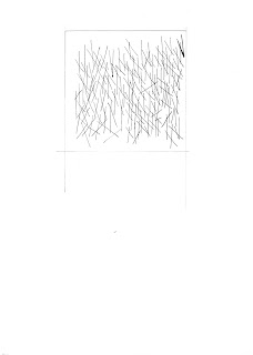
I wish to explore the contrast between
light and dark spaces by playing on contrast, black and white and
lighting.
jeudi 25 juillet 2013
DSDN142 Lab1: procedural sketches
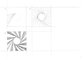
This first sketch replicates the final drawings obtained by Vera Molnar using her procedural method of drawing (http://www.atariarchives.org/artist/sec11.php)
This drawing was made by following the instructions given by Sol Lewitt (http://www.moma.org/learn/moma_learning/themes/conceptual-art/sol-lewitt-and-instruction-based-art), the filling for each square was determined randomly from the four choices given.
This drawing was done using the instructions and examples given by Edward Zajec (http://www.atariarchives.org/artist/sec16.php).
lundi 22 juillet 2013
jeudi 18 juillet 2013
DSDN144 Picture
I chose this picture as it displays some interesting lighting and because of the patience involved in making such a photo.
mercredi 17 juillet 2013
DSDN142 Lab 1 zentangles
These are the ten zentangles requested as homework for DSDN142:
First off, the reproductions of others work:
Frosty by Emily Perkans ( http://pinterest.com/pin/16466354859886951/ ) and Pinecone by Brad Ham ( http://pinterest.com/pin/16466354859963769/ ).
Baton by Carol Ohl ( http://pinterest.com/pin/16466354859033232/ )
Miander by Mimi Lempart ( http://pinterest.com/pin/16466354860461675/ ) and Auroknot - Bunzo flower by helen wiliams ( http://pinterest.com/pin/16466354860082618/ )
And now my own creations:
Fist, The Hex, it starts with a hexagon placed in the midle of the surface, than other hexagons are randomly placed in sequence so that a single hexagon isn't in contact with more than two others. When a "branch" reaches the edge of the surface, the process is repeated from the starting hexagon once more. The result is a beehive like pattern.
Second is this zentagle, inspired by the Japanese flag and barrel riffling, it starts out as a circle to which tangant lines are attached and than every other of the obtained spaces are filed in with color.
A fairly simple concept using hatching and line-weight to differentiate several pattern sections revolving around a trinity.
These last two zentagles use similar techniques, I divided the space using curves, than filed the resulting spaces with repetitive geometric patterns.
First off, the reproductions of others work:
Frosty by Emily Perkans ( http://pinterest.com/pin/16466354859886951/ ) and Pinecone by Brad Ham ( http://pinterest.com/pin/16466354859963769/ ).
Baton by Carol Ohl ( http://pinterest.com/pin/16466354859033232/ )
Miander by Mimi Lempart ( http://pinterest.com/pin/16466354860461675/ ) and Auroknot - Bunzo flower by helen wiliams ( http://pinterest.com/pin/16466354860082618/ )
And now my own creations:
Fist, The Hex, it starts with a hexagon placed in the midle of the surface, than other hexagons are randomly placed in sequence so that a single hexagon isn't in contact with more than two others. When a "branch" reaches the edge of the surface, the process is repeated from the starting hexagon once more. The result is a beehive like pattern.
Second is this zentagle, inspired by the Japanese flag and barrel riffling, it starts out as a circle to which tangant lines are attached and than every other of the obtained spaces are filed in with color.
These last two zentagles use similar techniques, I divided the space using curves, than filed the resulting spaces with repetitive geometric patterns.
mardi 16 juillet 2013
DSDN112 Lab1
Thes are the 150 word reviews of the websites foud in Web design index and Web dising index: by content by Günter Beer.
http://www.marcdahmen.de/
This website hosts pictures of Marc Dahmens architecture projects. It is an interesting website as it has a high degree of interaction as well as an interesting layout for the pictures. The pictures are laid out like a bunch of photos on a table with simple instructions as how to browse through them. The website is separated into two sections, a projects section and a picture section, making it easy to browse through.
This website suffers from some downsides though. First of all, there is no explanation as to what the site is and no information on the author or his intentions. Secondly there is no explanation for the pictures in the picture section, only a title. Being architecture projects, it would have been nice to have an ex[planation on the authors intentions for his designs. The projects section on the other hand has a nice succinct explanation for each project even though the pictures are a bit small.
This website regroups the works of
various artists over time in several “books”. This website give
you he choice of three languages (english, french and chinese),
meaning that is easy to access for a large number of people
throughout the would, and has a simple yet well thought out layout.
The information tabs are simple and obvious, the information given is
clear and concise. As for the actual art, all the pieces are
regrouped by theme in different “books”, each of which uses a
simple flash animation to turn the pages. The page has a very simple
and uncluttered feeling which allows you to really appreciate the art
without being distracted.
On the down side, the book-like layout
also means that the pictures have a seam in their center which is a
bit of a letdown as well as the fact that because of the
prensentation, the pictures are a bit small and cants be made bigger.
A web-design and printing company,
their website is quite interesting. Easy access to a great deal of
information yet, presented in such a way that the user isn't
confronted with a wall of text. The humorist pictures add a nice and
refreshing touch. There is a nice background of various photos
changing around but not distracting. A good point is the logo of the
company that is visible from the start and throughout the different
pages, being a simple logo it doesn't draw too much attention and
distract from the contents of the website but being there means that
one will remember it.
A good thing that I haven't seen on
the other websites is an extensive gallery of all their previous
projects with nice big pictures and screen-shots. Enough information
on the client to understand their intentions for each project.
Finally, the site is very easy to navigate, you can't get lost and
the various navigation boutons and links are clearly displayed and
marked.
Even though the site has no obvious
clues as to what one has to do to access most of its content, it has
a really cool interactive flash menu. Unfortunately, even though the
animations for the menu are very cool looking and well designed, they
are quite long, meaning a lot of downtime between different sections
of the website. Moreover, some of the animations are deconstructed
into two or three parts, requiring the user to click the screen to
launch the next part, unfortunately, the visual clue for this isn't
obvious at first which can lead to even more waiting between menus.
This is an example of a website that pushes the interaction with the
user too far.
On the bright side though, the menus
are simple and functional, information is displayed immediately and
in a comprehensive way. Information on the website itself and
external links are easily found which is a good thing.
By far the most impressive website of
the group, icoplasma is a design firm and it has the coolest website
I have ever seen. It has a very interesting and original format, with
a good level of interactivity. Moreover, all clickable objects are
obvious, stand out of the background and are very intuitive. The
website is easy to navigate and displays the necessary amount of
information about all projects presented. Moreover, the website gives
the choice of two languages, english and spanish, broadening it's
range of audience.
The only downsides to the site are the
size of the pictures for each project, which are very small, and the
lack of external links to the projects presented, especially the
web-design projects. Finally, the website has a lot of sound effects,
almost every action done on the website has an accompanying sound
effect, while not necessarily a bad thing, it can become annoying
after a while of browsing the site.
Inscription à :
Articles (Atom)


